
What’s the number one thing a client can do to elevate their photos? Wardrobe!
Let me explain:
Most established photographers have a certain style or look that they consistently achieve through both choice of location and editing. I happen to be a more ‘light and airy’ photographer, focusing on light, bright images, but other photographers have a warmer, or cooler, or moodier, or softer style. A lot of this comes down to how the photographer positions their clients in the light, and how they like to edit the images after, but a huge factor of how a photo ‘feels’ comes down to the colors and textures that the subjects are wearing.
It seems natural that photos with clients dressed in all black will have a different feel than photos where the clients are wearing light colored neutrals. It’s a totally different color palate! What clients wear can help reinforce my ‘light and airy’ style, or sort of work against it. I’m not saying it’s wrong to wear dark colors to photo sessions, but it may result in images that don’t feel as true to my style, and sometimes clients might feel disappointed that the photos don’t feel as bright and fresh as some of my other work.
But how are clients supposed to know about what colors work best for their photos??
Enter, my Style Guide!
Each client that books a session with me gets a digital copy of my style guide (and I have one just for seniors!). Inside they’ll find dozens of example photos with some of my best, most recent work, and text to help guide your wardrobe decision making, some ideas for what else to bring to your session and more. Follow that, and you’ll likely end up with images that match my photography and editing style, that work with the location, not against it, and just feel right.
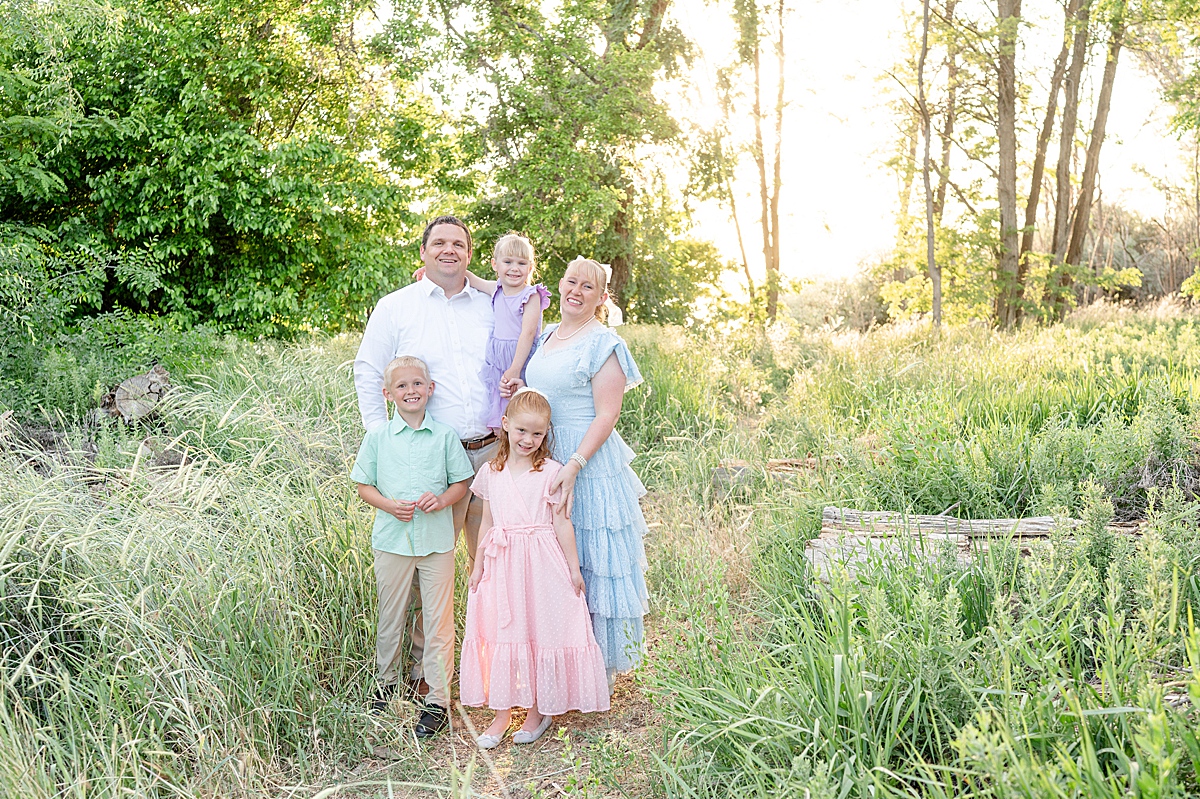
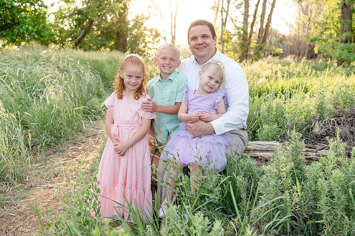
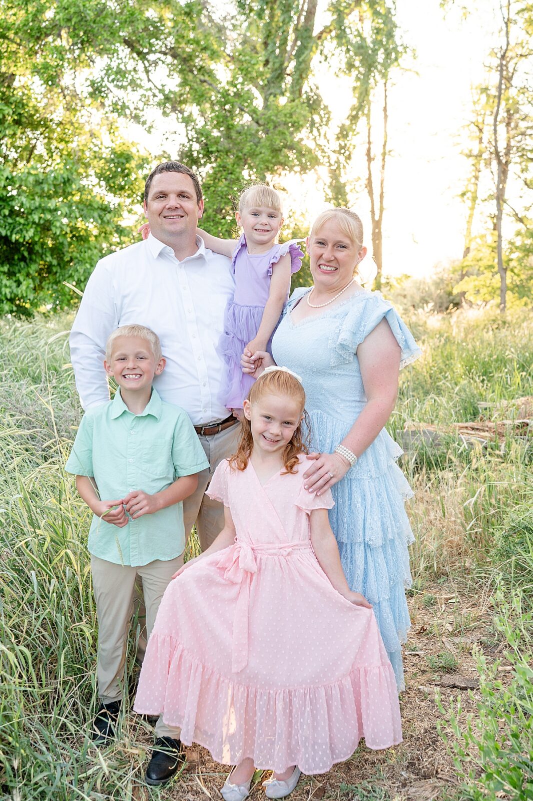
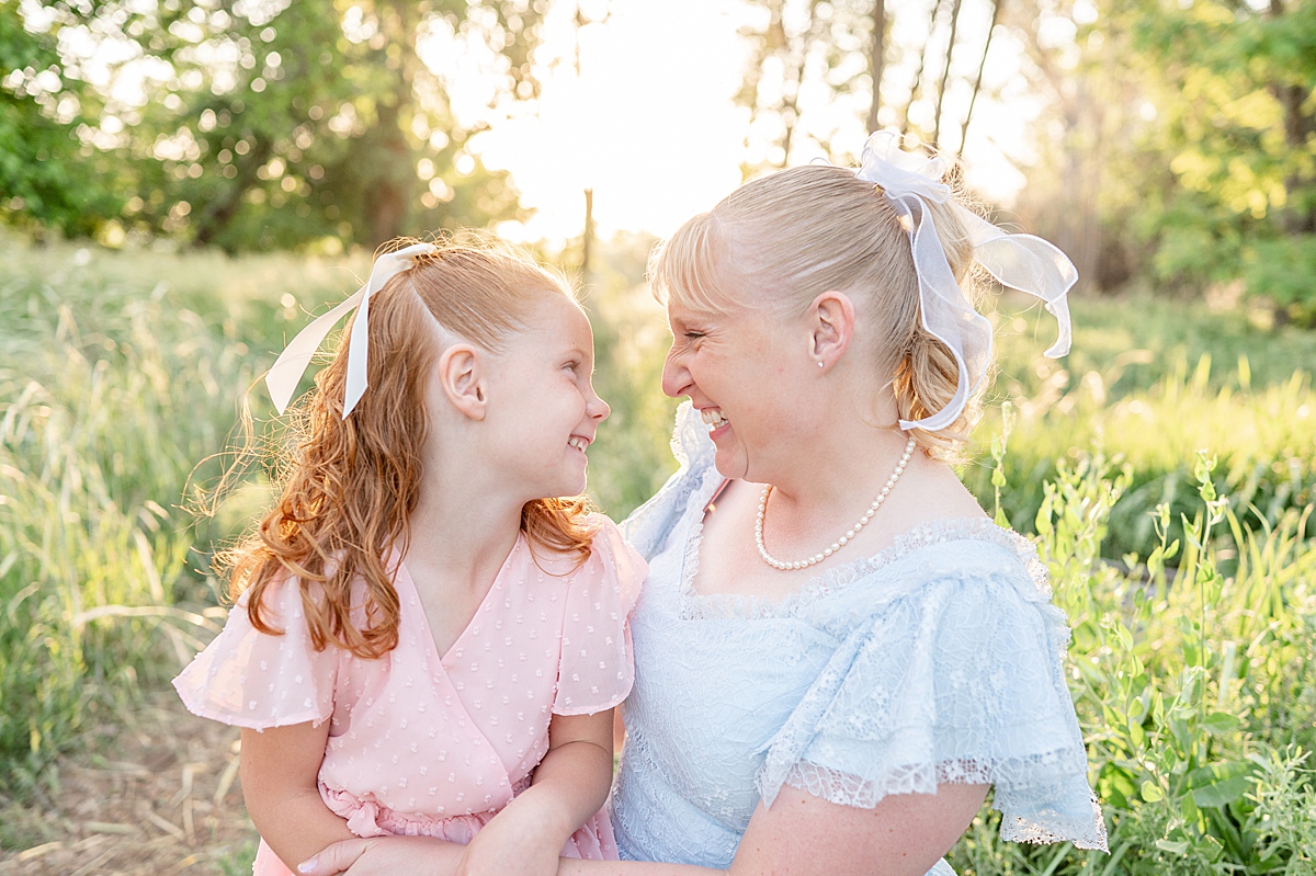
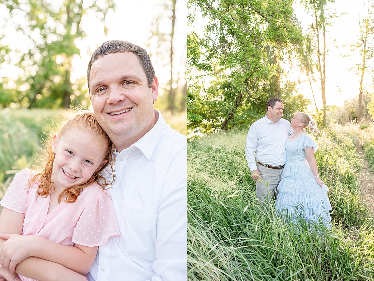
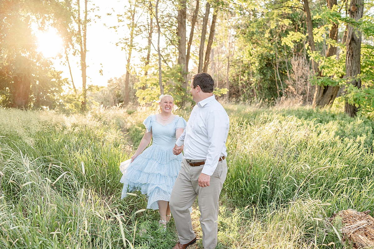
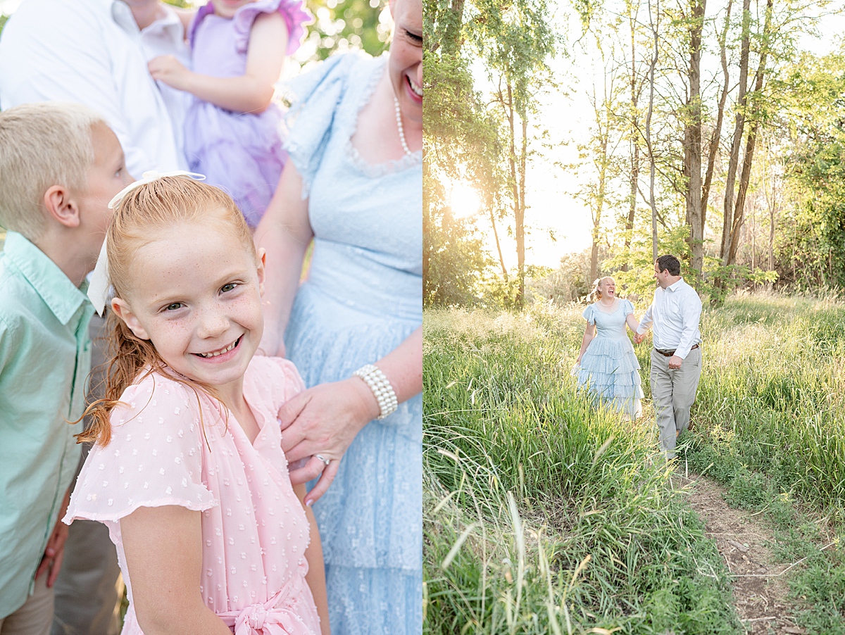
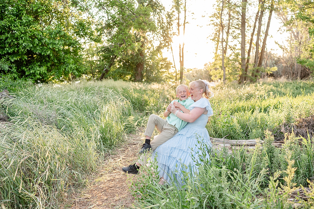
My friend Cherika is also a Yakima-based photographer, also with a light and airy style. So she knows how much wardrobe affects the feel of the images, and she always styles her family with a beautiful color palate! She’s a lover of pastels, so she incorporates her love of color perfectly with a more muted feel, and the result is images that are cohesive, feel fresh and work with my editing style. I think you can see just how dreamy these look. The fairytale vibes of this location certainly don’t hurt!
Cherika thank you again for choosing me to capture your family’s photos year after year. It’s the biggest joy to watch your kids grow up, and I look forward to the adventures we share year after year!


Be the first to comment